co.nz
Landing Page Analysis
Summary:
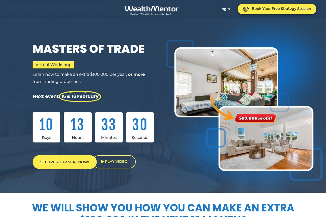
The landing page is visually appealing with a consistent blue color scheme that enhances the professional vibe. The use of bold and capitalized headings makes key points stand out, although the typography lacks diversity, leading to monotony. The sections logically flow, yet some redundancy occurs with information repeated multiple times in slightly different forms. However, the value proposition is clearly articulated, emphasizing potential financial gains and leveraging social proof effectively with testimonials and notable partnerships.
Yet, it's overly text-heavy in places, threatening user engagement. The CTAs are bright and prominent but feel a bit repetitive and overwhelming due to their sheer quantity on the page. More contrast would improve visual hierarchy, preventing potential information overload. The structure is generally fine, though some elements like mentor introductions seem excessively detailed, risking dilution of core messages. Correctly placed urgency signals (e.g., limited-time offers) are commendable though slightly overdone.
- Diversify typography to break the monotony and improve readability.
- Condense mentor profiles to reduce text and enhance core messaging.
- Reduce CTA frequency to streamline user experience.