zycle.eu
Landing Page Analysis
Vive la experiencia más realista de ciclismo indoor con nuestros productos ➤ Conoce la tecnología más avanzada del sector ciclo indoor. ¡Visita ZYCLE!

Summary:
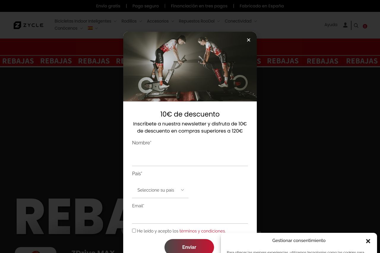
The landing page is cluttered with pop-ups that disrupt the user experience, making it hard to focus on the actual content. The primary message and value propositions are buried under the excessive advertising overlays, like the newsletter and cookie consent. The color scheme is bland but consistent, yet fails to leverage any exciting or engaging tones that could captivate visitors. CTAs are not only repetitive but also lack creativity and urgency, blending into the rest of the content and offering no real incentive to click. The overall structure is chaotic with no clear hierarchy of information, causing potential confusion and frustration for users. On the plus side, social proof is well-exhibited with recognizable partner logos, which helps build credibility. Yet, the professionalism takes a hit with the overwhelming pop-ups, making the design seem less thoughtful.
- Reduce the number of pop-ups and streamline their presentation.
- Enhance the value proposition clarity with highlighted key points.
- Improve CTA design and placement for better focus and motivation.