microfolliclehairtransplant.com
Landing Page Analysis
Summary:
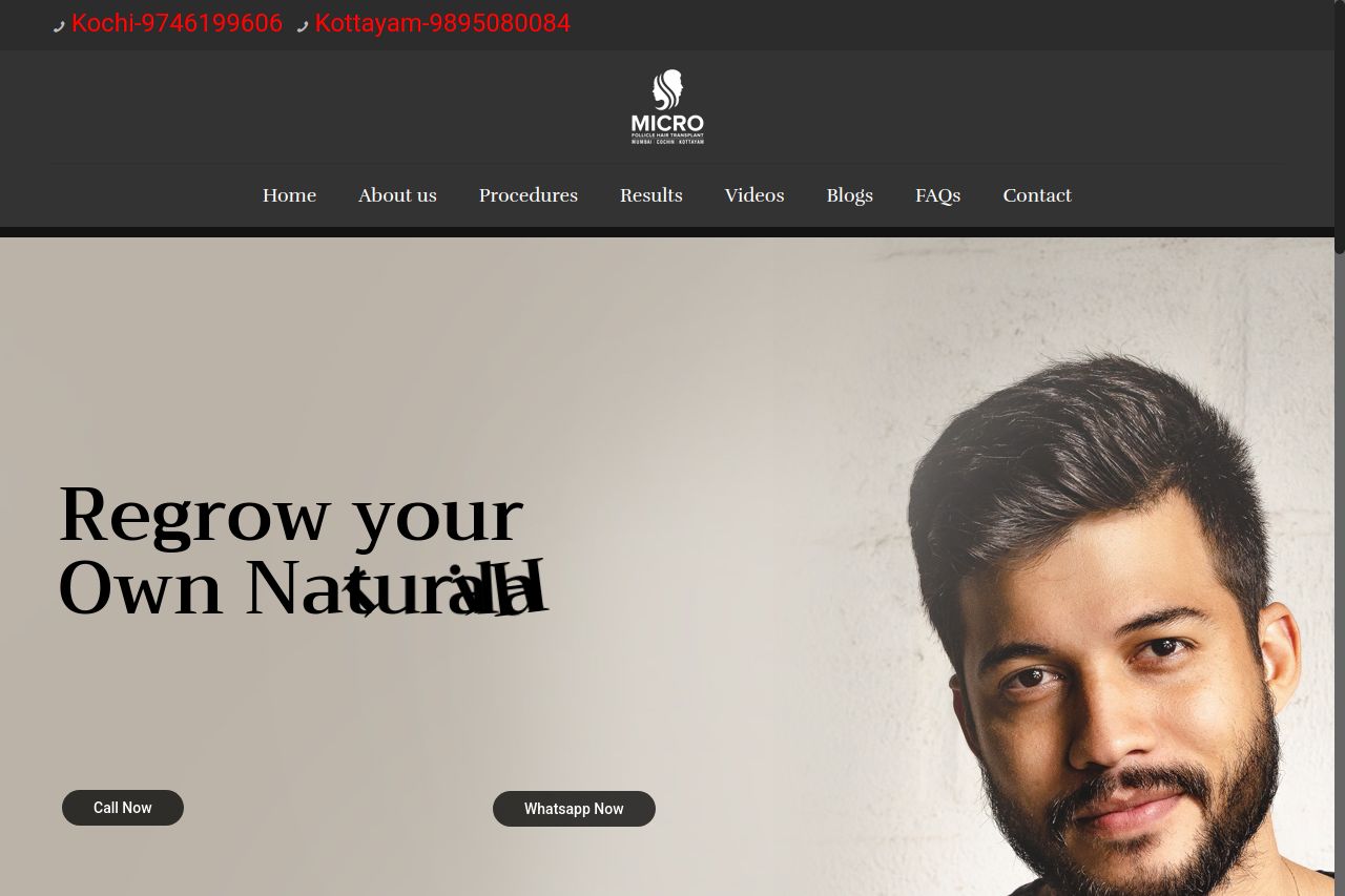
The landing page makes a decent first impression with its clean design, but it has some notable issues. The headline is straightforward but lacks specific appeal—it's all about generic benefits like “No Scars, No Side effects." Service icons are a bit cartoonish, which clashes with the overall professional tone. The "Call Now" and "Whatsapp Now" buttons blend in too much, failing to stand out as strong CTAs. There's a good use of testimonials and before/after photos, which enhances credibility. However, the color scheme is too dark, making the page feel heavy and limiting readability. The layout is logically structured, but some sections are crammed with images and text, affecting clarity. Overall, while the page has potential, it needs more strategic refinement to fully engage users.
- Brighten up the color scheme to improve readability.
- Enhance the CTAs to make them more prominent and action-oriented.
- Refine icons to align with the professional tone of the website.