chaqt.com
Landing Page Analysis
74

Share on:
Summary:
70
Messaging
70
Readability
75
Structure
65
Actionability
65
Design
80
Credibility
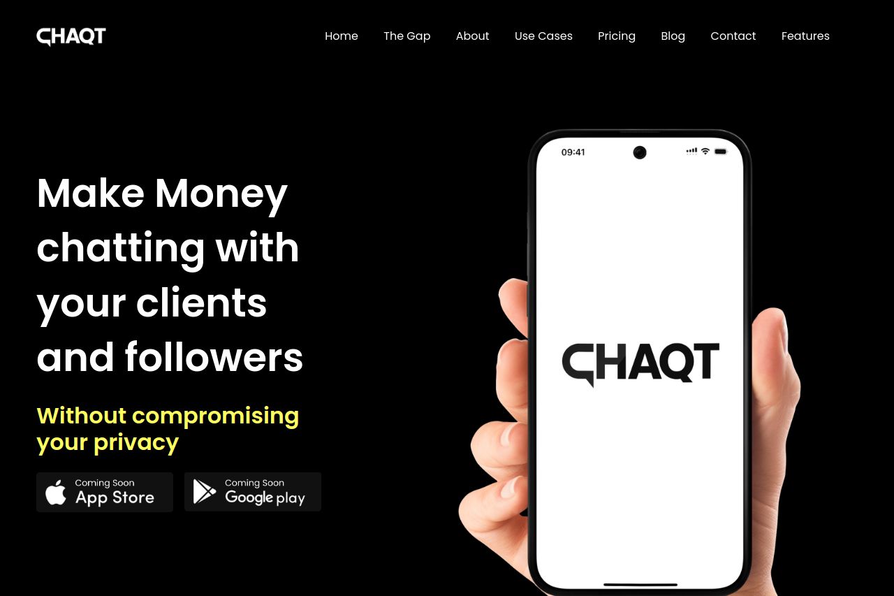
The landing page does a decent job of conveying its main message with a clear value proposition right away. The black and white color scheme provides good contrast but risks looking too plain. The use of text and images is balanced, but some sections feel overly verbose and risk losing the user's attention. There's a consistent style across the page, yet certain elements could be made more engaging. The social proof and team sections add credibility but could be enhanced further with more vivid imagery or interactive components. While the call-to-action buttons are visible, their urgency could be stronger in prompting users. Overall, it's functional but lacks some vibrancy and creativity to truly stand out.
Main Recommendations:
- Enhance the call-to-action buttons with more vibrant colors or icons to increase visibility.
- Reduce text in certain sections to maintain user engagement and improve readability.
- Incorporate more interactive or dynamic elements to make the page more engaging.