dashsocial.com
Landing Page Analysis
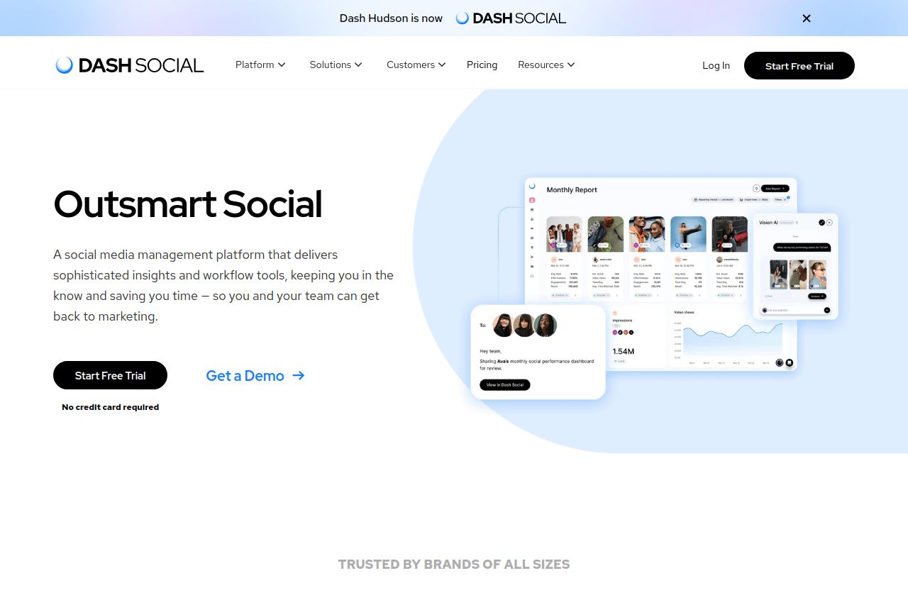
The all-in-one social media management platform for brands of all sizes. Get the insights and workflow tools you need to outsmart social with Dash Social.

Summary:
The landing page for Dash Social does a decent job in presenting its value proposition. The imagery of the dashboard and social media tools visually reinforces the product offer. However, the text throughout the site tends to be generic and doesn't sharply define the audience. Calls to action like "Get a Demo" are underwhelming and lack urgency or specific benefit statements. The design maintains a professional and consistent style but feels somewhat uninspired and lacks a unique edge to make it memorable. Credibility elements such as recognizable brand logos and testimonials lend authority. While the typography is clean and readable, the page lacks dynamic elements that could enhance engagement, and the visual hierarchy could be stronger to guide the user’s journey more effectively.
- Refine the tone of voice to more directly speak to a target audience.
- Enhance CTA text to include specific benefits or urgency, e.g., "Boost Your Engagement Now!"
- Improve visual hierarchy by varying font sizes and weights to emphasize key information.