uitvaart.nl
Landing Page Analysis
Summary:
The landing page for Amstel Uitvaarten succeeds in presenting a compassionate approach to funeral services, with effective use of testimonials to build trust. However, it's plagued by several critical failings that tarnish its overall user experience.
Firstly, the messaging is bogged down by excessive text that feels more like a novel than an informative guide. The idea of displaying empathy through words seems noble, but it dilutes the actual value proposition. A major revamp is required to make it clear, concise, and focused.
Readability is another casualty here. The dense text, coupled with paragraphs that could stretch from here to Amsterdam, provides little breathing space. The insistence on long sentences buries the main points instead of highlighting them.
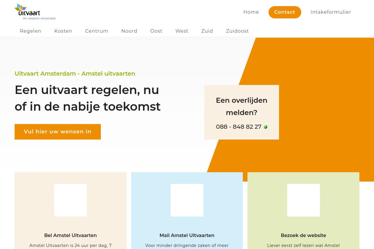
Design-wise, the visual hierarchy is practically non-existent. Everything is competing for attention, making it hard to distinguish the critical call-to-action from the mundane. Over-reliance on bright color blocks and too little focus on differentiation among text elements further clutters the experience.
Actionability suffers because the placement and design of CTAs (calls-to-action) are unimpressive, offering little to draw the eye. There is a sense of hesitation in how persuasive these are, failing to suggest urgency or importance.
Credibility is, however, a silver lining here. The inclusion of reviews and trust elements does lend a sense of reliability, but it doesn’t rescue the overall indigent presentation.
- Condense and clarify the main value proposition. Make it immediately understandable and impactful.
- Break up text into shorter paragraphs and use bullet points to improve readability.
- Improve CTA prominence and wording to make them more engaging and urgent.
- Use font size and color strategically to create a clear visual hierarchy.