landinganalyze.com
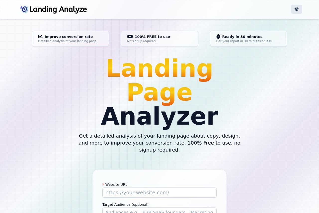
Landing Page Analysis
Get a detailed analysis of your landing page about copy, design, and more to improve your conversion rate. 100% Free to use, no signup required.
Summary:
Overall, the landing page feels straightforward and practical. The primary message "Landing Page Analyzer" is prominent, capturing exactly what the tool offers. The benefit statements in the badges like "100% FREE to use" and "Improve conversion rate" also stand out well.
However, this clarity isn’t completely carried throughout. The list of analyzed pages looks cluttered and doesn’t clearly indicate how they relate to the user’s journey or expectation. The shadow on this section weirdly matches the text color palette, creating a disjointed visual.
The CTA "Try For Free" is set in a bold red, however, the phrase itself lacks a sense of urgency or specific call to action. The lack of strong credibility elements like testimonials or case studies is apparent. There is a single CTA, and it's not utilized effectively multiple times down the page.
The design, while clean, gets a bit boring and doesn't engage the user after the initial landing. The backgrounds used in the FAQ section could use more differentiation, as the text doesn't pop out. The FAQ itself is helpful but feels unfinished with generic questions that could be expanded.
The Open Graph data is fairly on point but lacks punchy keywords or a unique hook to differentiate this tool's offer.
- Consider adding user testimonials or case studies to enhance credibility.
- Rework CTA text to be more action-driven and emotionally compelling.
- Improve visual distinction and relevancy of the analyzed landing pages section.
- Expand and enhance FAQ with detailed and unique questions.