t-akibet.com
Landing Page Analysis
Summary:
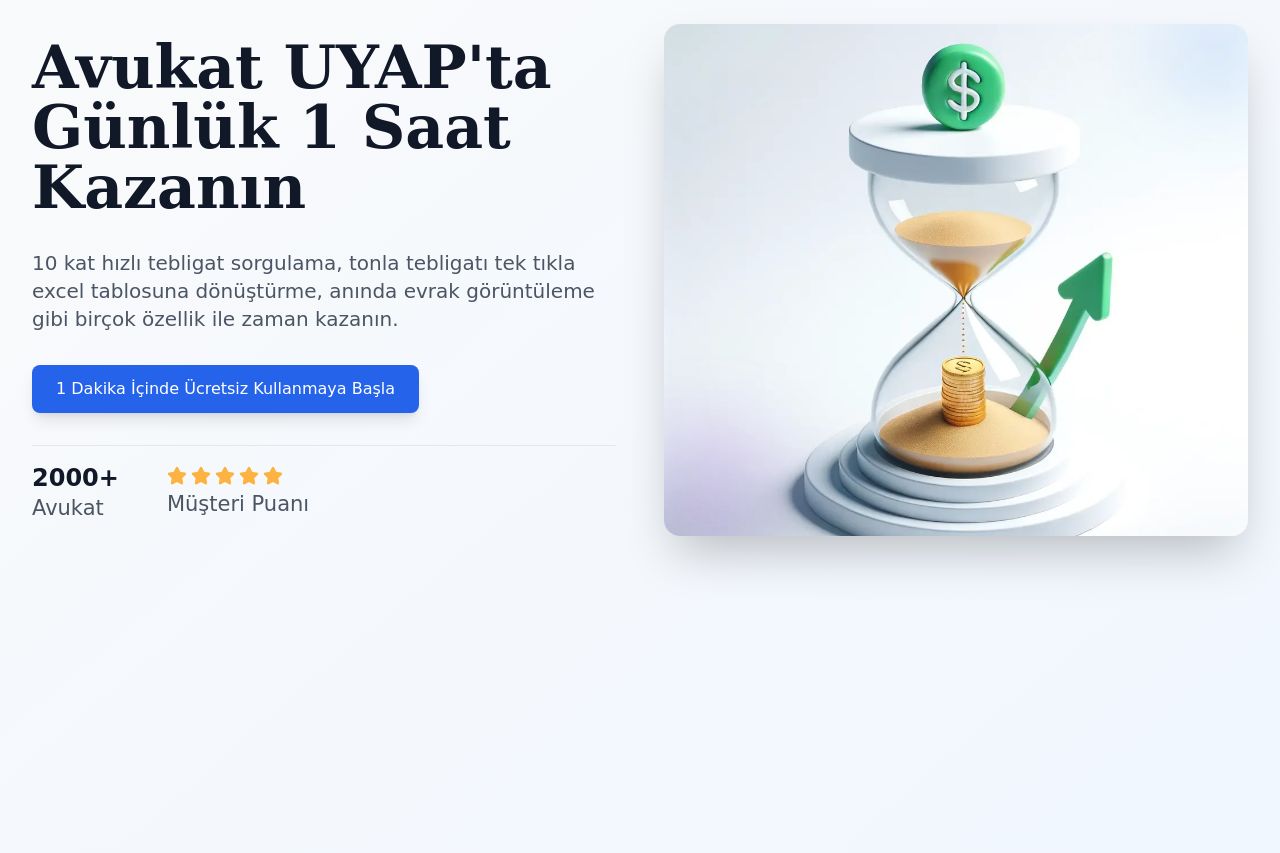
The landing page does a decent job targeting lawyers with practical solutions, but it could be more impactful. The value proposition is somewhat clear, highlighting significant time savings in legal processes. However, it feels cluttered with text-heavy sections, making it hard to capture the core message quickly. The testimonials and client logos add credibility but could be more prominently displayed earlier in the page. There’s consistency in color use, creating a professional look, but the overall design lacks any distinctiveness that could catch attention. The CTAs are present and visible but could be improved to enhance urgency and actionability. The structure feels unnecessarily lengthy, with important information sometimes buried under too much detail.
- Enhance the visual hierarchy by using varied font sizes and colors to emphasize important sections, like the CTA.
- Simplify text in sections where legal jargon is used to improve readability.
- Reorganize testimonials and social proof to appear earlier in the landing page for increased credibility.