plgos.com
Landing Page Analysis
Feedback Workflow by PLG OS is a powerful app designed to simplify feedback collection. Create SDK components for React, Flutter, and more to gather user feedback efficiently. Manage all feedback with an intuitive dashboard.
Summary:
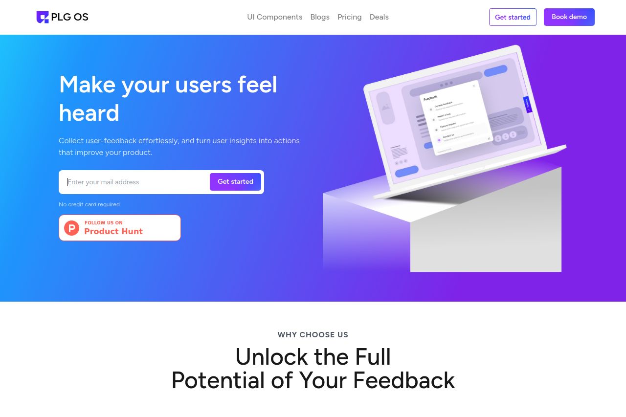
The landing page has a visually appealing design with a sleek color scheme that aligns well with the product's branding. The hero section effectively communicates the primary value proposition, "Make your users feel heard," which is straightforward and engaging. However, there's a lack of detailed information about specific features or use cases, which could help potential users understand the product's full capabilities.
Readability is generally good, though some sections could benefit from clearer typography and more varied font sizes to enhance hierarchy. The design is consistent, maintaining a cohesive look throughout, but could use more emphasis on community or social proof to bolster credibility.
The Call to Actions (CTAs) are mostly well-placed, but there could be more variety in CTA phrases to maintain engagement. While the page flow is logical, it misses an immediate showcase of big benefits or testimonials which might improve trust and allure.
- Add detailed examples or case studies to demonstrate product use.
- Incorporate testimonials or client logos for trust enhancement.
- Improve CTA variety to keep engagement up.