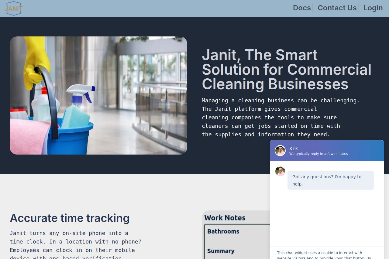
janit.app
Landing Page Analysis
The Janit App aims to be the platform for commercial cleaning companies

Summary:
The landing page for Janit App does several things right but also misses some key marks. The value proposition is clearly stated, and the benefits of the app are articulated well, which is crucial for attracting businesses in the commercial cleaning field. However, the page could be more engaging visually and requires better alignment with its target audience's needs.
The readability is decent, with simple text and adequate contrast making it accessible. Yet, the design lacks personality. The colors are pretty basic, and there's a lack of appealing images or videos that could draw more attention. The hierarchy is not well defined, which might make important points easy to overlook.
Actionability suffers from a series of CTAs that are present but aren't striking or particularly persuasive. Moreover, there's a lot of distracting elements, like the chat popup, which obscures content. The website offers sufficient transparency and credibility through a detailed 'Our Story' section, but it lacks significant visual appeal and could benefit from more professional testimonials and client logos.
- Use more engaging and targeted CTAs to encourage conversions.
- Improve overall color scheme for more visual appeal.
- Add client testimonials or case studies to increase credibility.