qralarm.app
Landing Page Analysis
Summary:
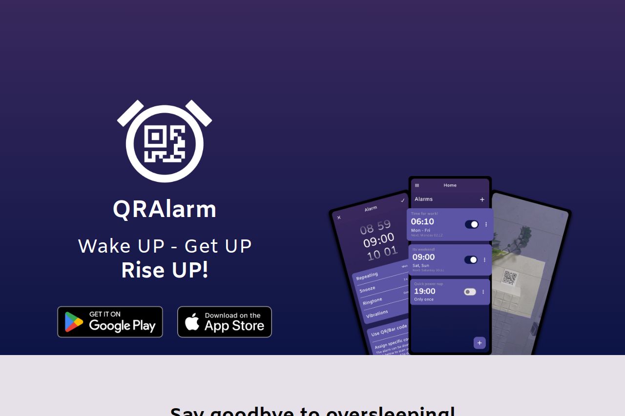
The landing page for QRAlarm is visually coherent but falls short in some areas. The hero section quickly introduces the product's main goal, which is useful. However, the text repetition and lack of a compelling hook make it feel redundant rather than engaging. The overall design is clean but somewhat dull, lacking any dynamic elements that might captivate the audience's attention. The imagery is decent but could offer more to explain the app's unique features visually. Key information, like pricing for the Pro version, is entirely absent, which can be frustrating for users looking to make a purchase decision. The page does include strong social proof with testimonials, helping to build trust. Yet, the focus on the CTAs feels a bit underwhelming and could be better emphasized to drive action.
- Introduce more engaging visuals or interactive elements to capture attention.
- Clearly present pricing information or a comparison between the free and Pro versions.
- Enhance the call-to-action buttons to stand out more and communicate urgency.