cryptotoken.dev
Landing Page Analysis
Create and launch your own memecoin website in minutes. Use our professional website builder for your next crypto project.

Summary:
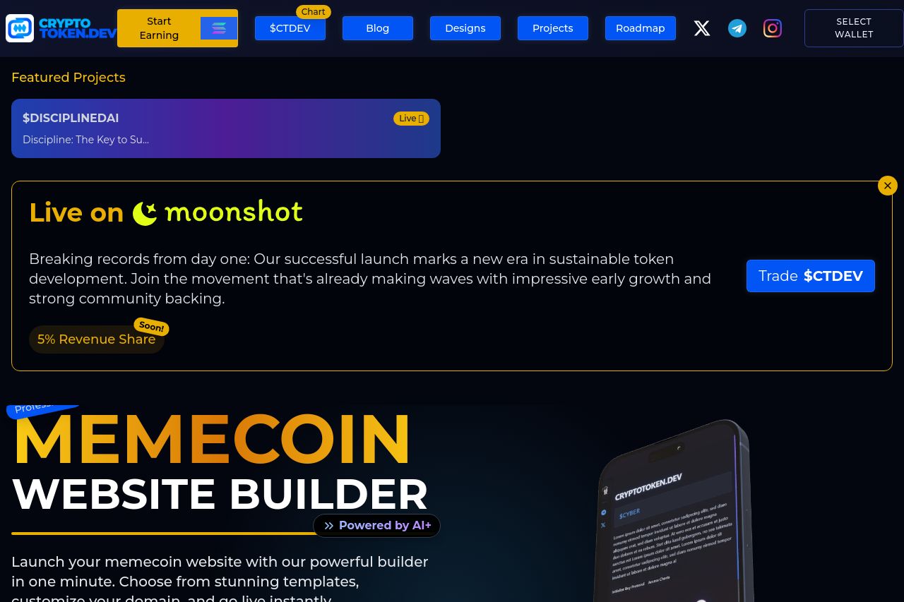
The landing page for CryptoToken.dev gives a bold and energetic vibe with its bright colors and catchy phrases focusing on speed and professionalism. However, several elements feel slightly overwhelming or inconsistent, potentially causing distractions. The value proposition is somewhat clear, but the site could communicate the benefits of the Memecoin Website Builder more effectively. There's room to improve clarity about who this service is specifically designed for. The images of the phone on different backgrounds are a nice touch and add visuals to the offering, though they could be refined with clearer examples of the builder in action. The CTAs, both in text and placement, need more emphasis to stand out from the surrounding content, which can feel scattered at times. Consistency in design could strengthen user trust and reduce confusion. Overall, the aesthetic appeal is there, but the information can get lost due to competing visual elements and content density.
- Clarify and emphasize the value proposition of the Memecoin Website Builder clearly and succinctly.
- Improve CTA visibility and clarity, ensuring they stand out and guide the user smoothly.
- Enhance visual hierarchy to prevent overwhelming the user with too much information at once.