signup.now
Landing Page Analysis
Create a signup page for your SaaS

Summary:
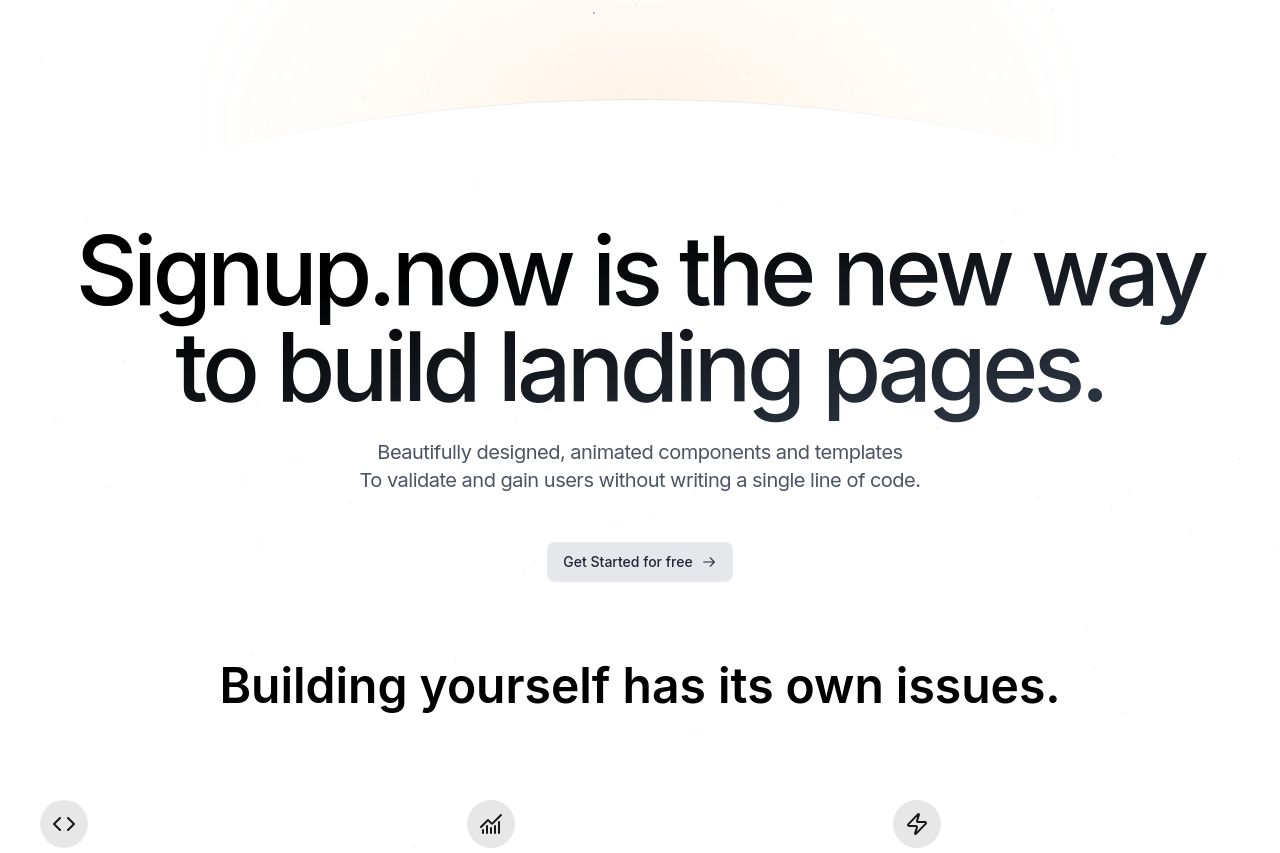
Signup.now strives to redefine how landing pages are built, targeting non-technical users. While the bold headline grabs attention, emphasizing "the new way to build landing pages," it leaves out essential details about what exactly makes it different or better. The small, gray subtext is too easily overlooked but carries vital information: the lack of coding needed. The secondary headers like "Building yourself has its own issues" are persuasive but could better relate these issues directly to customer pain points.
The graphics, particularly the large placeholder image, don't efficiently communicate the steps or ease of creating a signup page, feeling more decorative than informative. The image's purpose needs clarity—show how effortless it is or don't include it at all.
The call to action is prominent but lacks urgency or uniqueness, and some will wonder, "Why start now?" or "What's unique about this offer?"
The overall page has a clean and professional design, but the sections feel disjointed—they don't convincingly lead the visitor to the conclusion that this is essential for them. The visual elements are not optimized for readability, and the video is not particularly engaging or explanatory.
The social proof section is nonexistent. Without testimonials, reviews, or partner logos, the site lacks credibility, making it hard for first-time visitors to trust the service.
- Clarify the unique value proposition in the main headline or subtext.
- Incorporate clear and relevant testimonials or proof of concept screenshots.
- Revise CTA to include urgency or specific benefits.
- Improve video/image to explicitly show simplicity and ease of use.
- Enhance text and image contrast for better readability.