technorucs.com
Landing Page Analysis
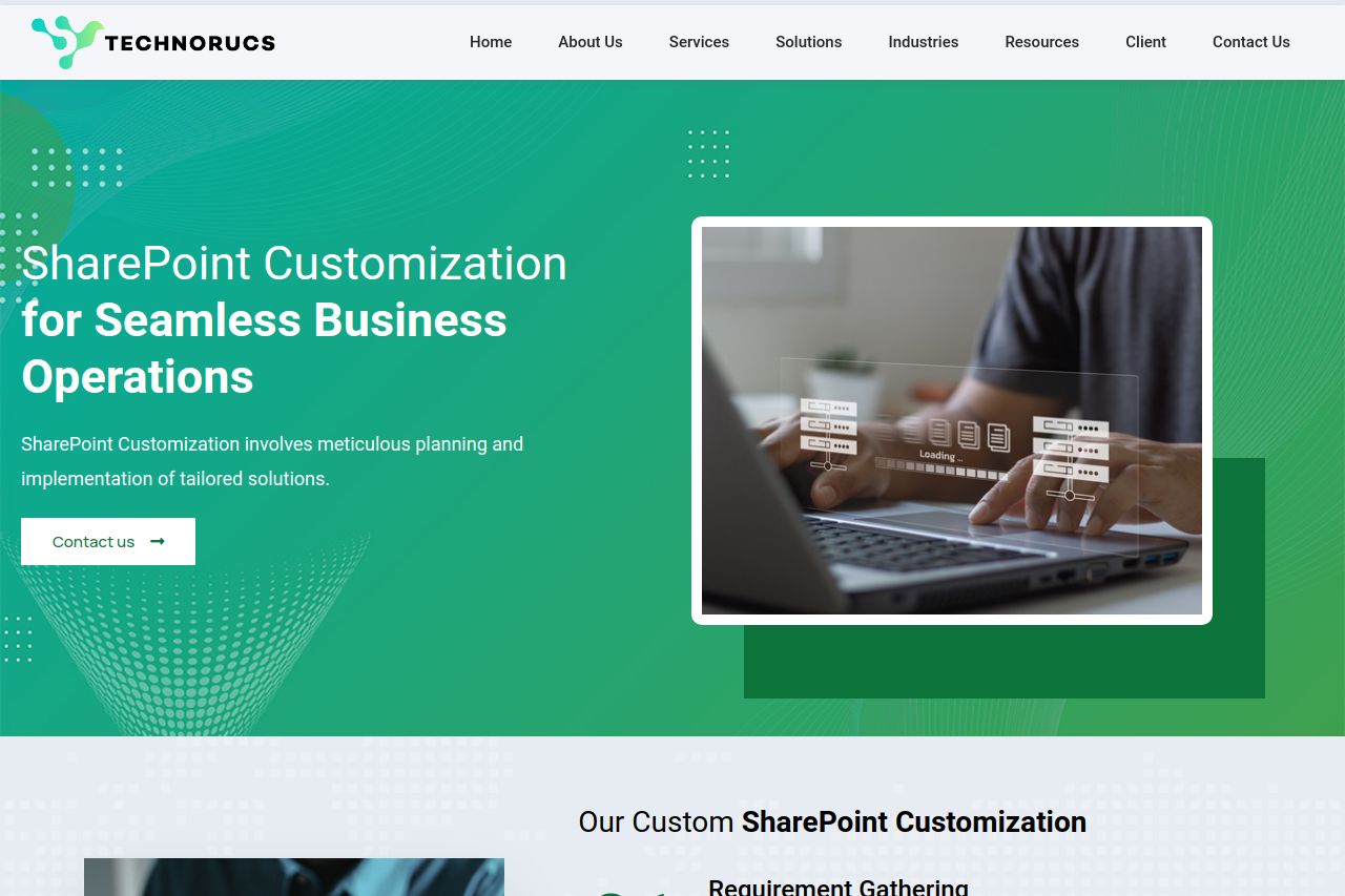
Develop intranet customization, collaborative platforms, and user-friendly interfaces through intuitive dashboards and reports using SharePoint Customization.
Summary:
The Technorucs landing page is a mixed bag.
On the plus side, the design is consistent, and the color scheme matches the branding well, providing a professional look. The information is organized logically, divided into clear sections, with headings that effectively guide the user.
However, there's a severe lack of punch in the messaging. The value proposition is vague and doesn't immediately tell visitors what exactly differentiates the service. The CTAs blend too much with the background and are easy to overlook. The imagery used doesn't feel very unique or engaging. Also, testimonials could be more prominent to boost trust and credibility. Call to action placements are inconsistent, impacting the user journey.
- Clarify and strengthen the value proposition.
- Make CTAs more prominent and actionable.
- Incorporate more engaging imagery and visuals.