futura.study
Landing Page Analysis
Entra nella facoltà di medicina dei tuoi sogni: supera il test di ammissione con il corso e le simulazioni illimitate di Accademia Dei test.
Summary:
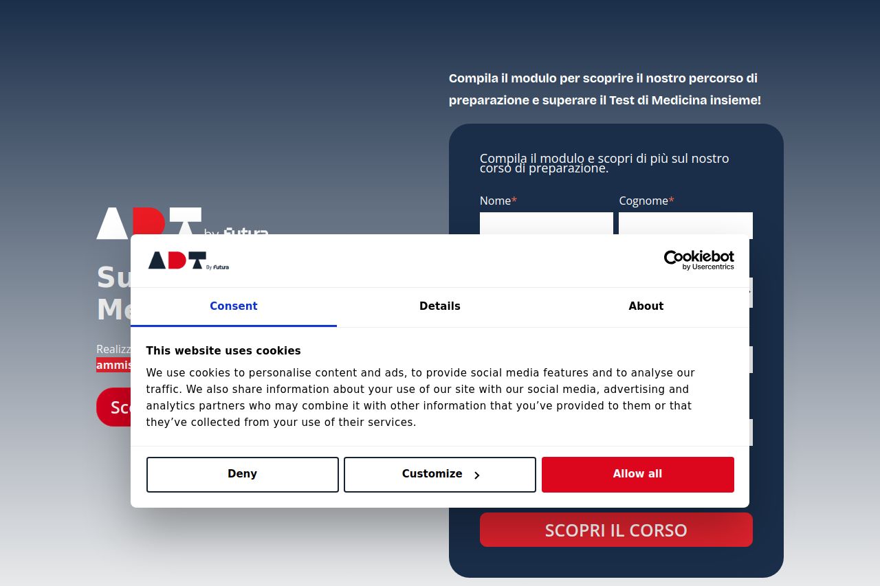
The landing page tries to convey trust with its use of structured content and a consistent color scheme, but there are many areas where it can significantly improve. The hero section fails to immediately communicate the value proposition clearly due to an overwhelming cookie consent pop-up and a lack of strong initial messaging. The form is placed prominently, but without a clear explanation of what users gain by filling it out. There is an over-reliance on blocky sections which makes the page feel more like a checklist than an engaging journey. Visually, important CTA buttons are noticeable, but there's a mismatch between their prominence and the interest they generate due to inadequate context or compelling copy around them. Social proof is there, but it doesn't make a strong enough case due to a lack of detailed context or emotional connection. The typography is simple and mostly effective, but it could make better use of bold or highlighted text to emphasize key points. Overall, a more dynamic and user-friendly design could enhance the user's journey through the page.
- Enhance the value proposition clarity by using stronger and more immediate messaging in the hero section.
- Reduce the visibility of the cookie consent to ensure it doesn't block important content at first glance.
- Add more engaging and detailed copy around the CTA buttons to better convey their value.