codefa.st
Landing Page Analysis
CodeFast is the best coding course to learn how to turn your idea into an online business, fast.
Summary:
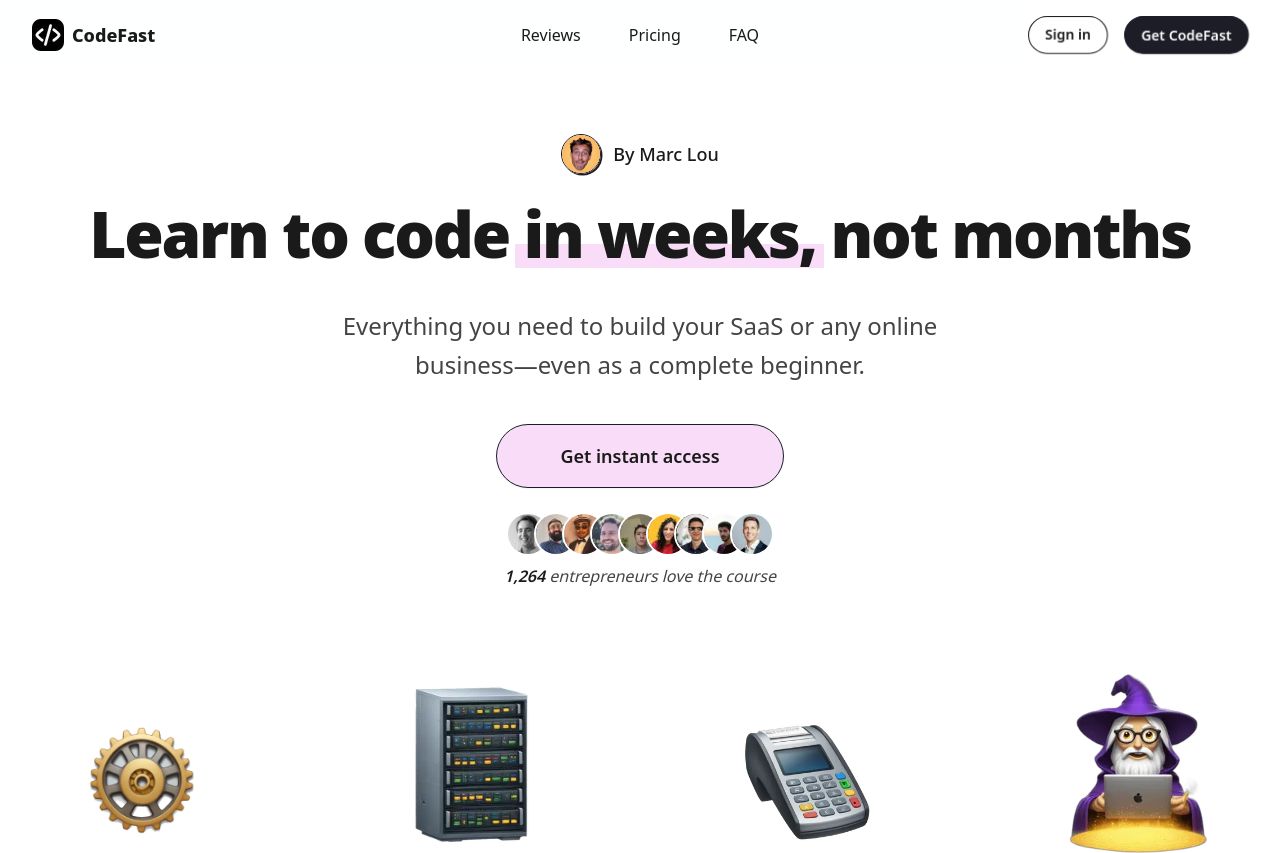
The landing page tries to position itself as a fast-track coding course for entrepreneurs, which is appealing. The use of a bold headline "Learn to code in weeks, not months" instantly communicates the value proposition. The layout is generally clean, although some sections like the testimonials feel overly stretched and repetitive.
However, the page becomes cluttered with competing CTAs at multiple places, which may confuse users. The tone does align with the entrepreneurial spirit but risks sounding overly gimmicky, with phrases like "Learn in weeks, not years." This might undermine credibility to those who prefer substance over sizzle.
The sections attempt to visually condense a lot of information with icons and graphics, but it's inconsistent at times. The pricing is clear, yet the value differentiation between the basic course and the bundle is not effectively communicated.
- Reduce the number of CTAs to avoid user confusion.
- Clarify the benefits of choosing the bundle over the basic course.
- Improve the visual consistency across sections for a more unified appearance.