bootnow.co
Landing Page Analysis
Sortez du lot avec un site canon et performant 📈 Profitez d’un audit gratuit pour booster vos conversions avec nos recommandations. Conquis ? Passez à la vitesse supérieure avec nos experts en Copywriting, UX/UI Design et Webflow pour créer le site de vos rêves.
Summary:
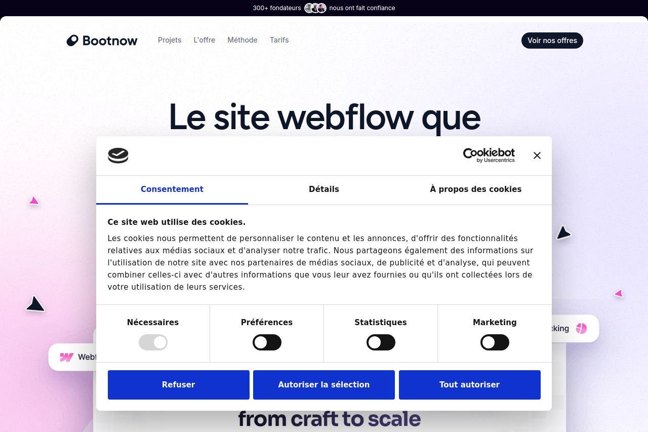
The overall aesthetic is quite pleasing; the design is modern and clean. However, the incessant cookie consent pop-ups are a major disruption to user experience, obstructing content on every screenshot you've provided. It severely impacts your users' ability to engage with the content smoothly. The primary message is not communicated effectively given the distraction.
The visual hierarchy regarding text and color is thoughtfully executed, making key points stand out. Contrast is properly maintained to ensure readability. However, there's an overload of information without a clear focus on conversions. The CTA visibility is decent but could be more strategically placed.
Credibility elements like testimonials exist, giving some level of trust, but more could be done to highlight important features or use cases. Additionally, the language could be more aligned with user needs to make the offering more compelling.
In essence, the page suffers from excessive interference due to cookie banners which subtracts from what could be a solidly designed experience.
- Reduce cookie consent pop-ups. Make it appear only once or use a less intrusive design.
- Enhance CTA placements by positioning them where they're more likely to be seen.
- Emphasize key messages more clearly to communicate the main value proposition.