nike.com
Landing Page Analysis
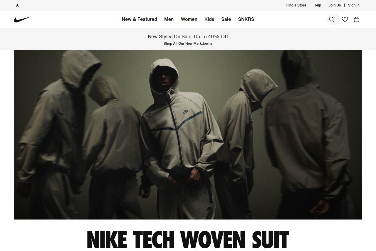
Inspiring the world's athletes, Nike delivers innovative products, experiences and services.
Summary:
The landing page leverages a strong visual appeal with high-quality imagery that emphasizes the brand's stylish and athletic vibe. The use of negative space and minimal text helps maintain a clean and modern look. However, there are some issues that could be improved. The messaging could be more direct and concise to enhance clarity and engagement with the audience. The navigation, while simple, might benefit from more prominent headings or subheadings to guide users through diverse product categories. Additionally, the call-to-action buttons, though present, could stand out more—they lack urgency and excitement. Overall, the page is visually cohesive but needs tweaks to actionability and messaging for a better user experience.
- Improve the clarity of the value proposition by adding more direct messages about product features.
- Enhance the CTAs to make them more prominent and action-oriented, such as 'Get Yours Now.'
- Consider adding subheadings to improve navigation and guide users through the offerings.