devdreaming.com
Landing Page Analysis
Learn web development with our tutorials on React JS, Next JS, JavaScript and JAM stack. Watch video tutorials, find the best development tools on our website.

Summary:
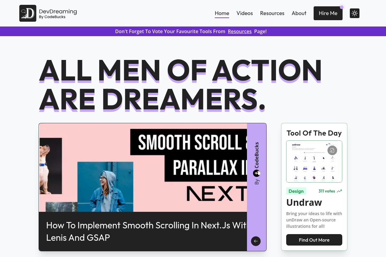
Overall, the landing page does a competent job in delivering content to developers. The layout is visually appealing, and the color scheme fits the tech-oriented theme. The messaging generally targets the developer audience effectively, but the value proposition could be more explicit. Readability is mostly maintained with clear typography and layout. However, the page structure feels cluttered due to excessive categories and sections packed with information. The CTAs are barely noticeable and could benefit from more strategic placement and emphasis. Despite showcasing some social proof, the credibility aspect could be strengthened by adding more testimonials or recognizable client logos.
- Make the CTA buttons more prominent to encourage action.
- Clarify the main value proposition to explain what sets the site apart.
- Reduce clutter by streamlining categories and focusing on key contents.