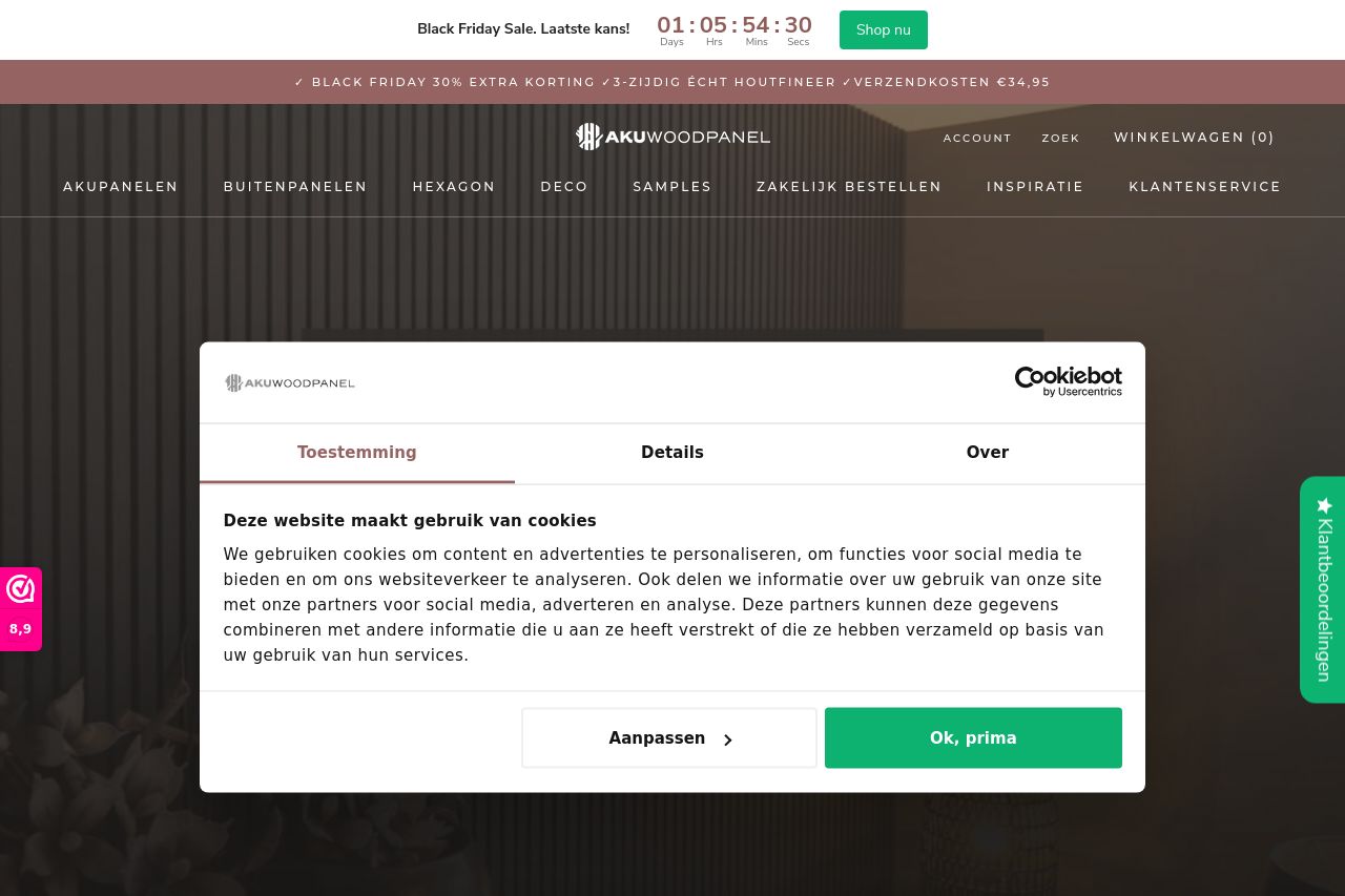
akuwoodpanel.nl
Landing Page Analysis
30% Black Friday sale! Bestel de mooiste houten Akupanelen van Nederland bij AKU Woodpanel. Onze akoestische wandpanelen zijn gemaakt van 3-zijdig houtfineer.

Summary:
The overall design of the page is visually appealing with a consistent color scheme and professional look. The use of images enhances the aesthetic while maintaining a clean layout. However, the messaging could be clearer in defining the value proposition and target audience explicitly. While there are clear product categories, the descriptions lack depth and could benefit from stronger, action-oriented language. The CTAs, like "Bekijk de producten," could be more impactful. The readability is decent, but some sections are overly text-heavy. The supremacy of reviews is a strong point, boosting credibility significantly. Yet, the navigation feels slightly cluttered, and the hierarchy isn’t perfectly intuitive.
- Enhance the main value proposition with a clearer, more engaging headline.
- Improve CTA text to make it more action-oriented and specific.
- Simplify and declutter navigation for better user engagement.