mbaldamus.com
Landing Page Analysis

Summary:
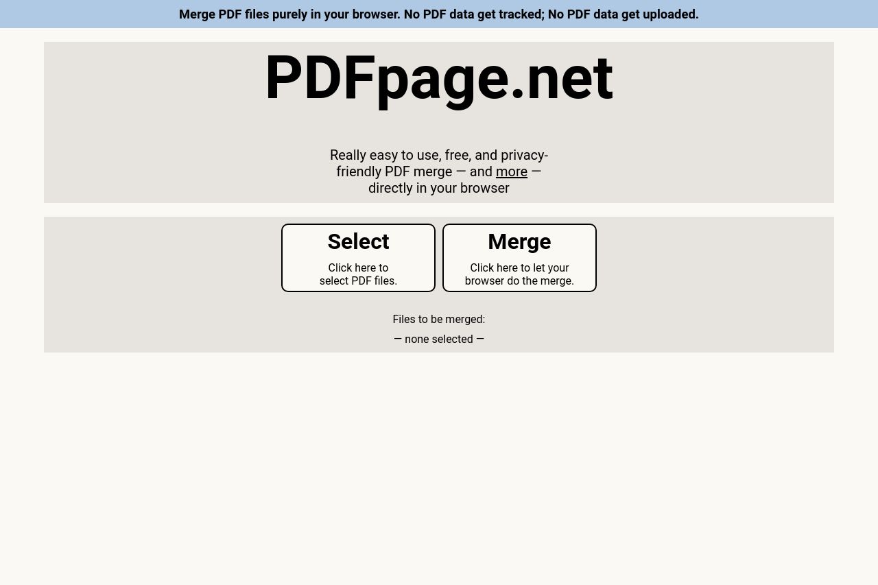
The page keeps things straightforward, with its purpose clearly stated as merging PDF files directly in the browser, promising privacy and ease of use. However, it feels a bit too bland and lacks visual appeal. The headline stands out well, but the rest of the design feels outdated and generic, offering zero excitement to the visitor. There's also a missed opportunity in the use of supporting imagery or icons that could enhance usability.
The value proposition is clearly articulated, but the lack of detailed features or benefits may leave users wanting more information. The tone is straightforward, which is fitting, but it doesn't work to engage the audience deeply. Readability is mainly okay, though the blocky, text-heavy style can deter users.
The calls-to-action are prominent but lack creativity in their wording and placement. Clarity and simplicity come through, but at the cost of visual coherence and memorability. There's no sign of social proof or credibility factors, which is a glaring omission for a service that deals with document privacy and manipulation.
- Incorporate more engaging visuals or icons to modernize the look and feel.
- Add social proof elements like testimonials or client logos for credibility.
- Enhance the CTA with more action-oriented language and better placement.