medigo.nl
Landing Page Analysis
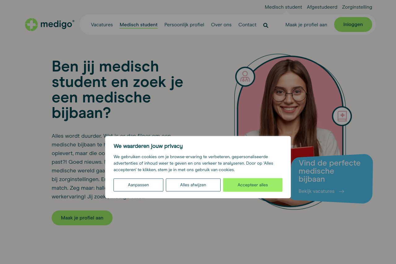
Ben jij medisch student en op zoek naar een medische bijbaan? Meld je aan en ontvang het persoonlijk vacature aanbod voor jouw regio.

Summary:
Positive Aspects: The webpage has a clean and clear overall design, and the messaging is relatively straightforward, appealing directly to medical students looking for part-time work. Consistency in design elements helps maintain coherence across the page, and social proof elements like testimonials could add credibility once visible. Negative Aspects: There are significant readability issues, primarily due to the long blocks of text and lack of proper visual hierarchy among sections and headings. Call-to-action (CTA) buttons don't stand out enough due to lack of contrast and distinction. The cookie consent message is intrusive and blocks content view, which disrupts user experience. Moreover, the navigation could use more intuitive headings to improve browsing efficiency.
- Enhance the visibility and contrast of CTA buttons with bolder colors.
- Reduce the obstruction caused by the cookie consent message.
- Improve visual hierarchy by using larger, bolder headlines and more white space.
- Simplify and shorten text blocks to improve readability.