nike.com
Landing Page Analysis
Entdecke Produkte auf Nike.com. Kostenlose lieferung und gratis rückversand.
Summary:
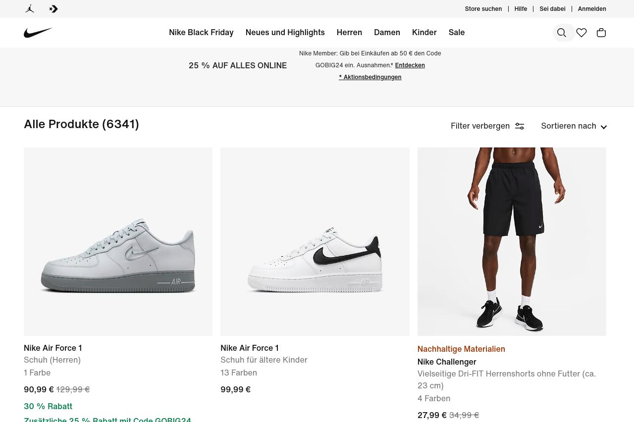
The landing page for the products on Nike's German site nails the brand's sporting aesthetic while cramming an overwhelming number of products onto one page. Strengths include a strong brand identity and professional design – it's clean and minimalistic. The discount information is quite clear, which might attract price-sensitive users. However, the page feels cluttered due to the density of product listings, and the repetition of the same discount code makes the promo feel less unique or urgent. Additionally, there's little distinction between sections, making it hard for users to focus on individual products or offers.
The value proposition is unclear. What makes Nike's selections stand out isn't communicated well enough – it's all just another shoe in a sea of shoes. CTAs are not particularly engaging; they lack the bite to drive immediate action. The design looks professional, but the structure is chaotic, with information thrown everywhere, making it a mad dash just to absorb what's displayed. Social proof isn't highlighted to its full potential, missing an opportunity to leverage brand trust.
- Reduce product overload by grouping or filtering items better to improve focus on individual products.
- Enhance the value proposition on each product card to communicate why these products stand out.
- Improve CTA design and placement to make them more action-oriented and appealing.