sabioedu.com
Landing Page Analysis
Corrige exámenes con SABIO
Summary:
The landing page for SABIO aims to present an AI-driven solution for simplifying evaluation processes. It starts with an assertive headline, focusing on simplifying evaluation, which is clear but lacks specific details about how it differentiates from other solutions. The use of blue and white provides a professional and clean appearance, yet it feels slightly predictable and lacks visual excitement.
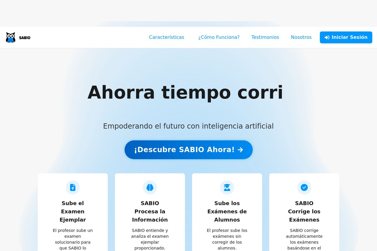
Moreover, the steps outlined in both sequences of using the product are straightforward, but they are a bit text-heavy and not visually engaging enough. The connectivity problem indicated by "We couldn't verify the security of your connection" is a glaring technical issue that could break trust immediately. Additionally, while the value propositions like "Ahorrar Tiempo" and "Mejora la Precisión" are positive, they feel a bit repetitive without offering deeply compelling or unique advantages.
The call-to-action buttons are clear and action-oriented but blend almost too much with the overall design, lacking a distinct stand-out quality that grabs attention. Credibility is attempted through social proof with a "Join thousands of educators" message, yet the lack of testimonials or client logos weakens this claim.
Overall, it's a decent effort, but there are crucial areas, particularly in the areas of engagement and differentiation, where improvements could be dramatically beneficial.
- Add unique selling propositions that clearly differentiate SABIO from competitors.
- Integrate more engaging and dynamic visuals or infographics to illustrate processes.
- Include testimonials or recognizable client logos to boost credibility.
- Address and fix the technical error on the page to avoid negative impressions.
- Enhance the visibility and distinctiveness of call-to-action buttons.