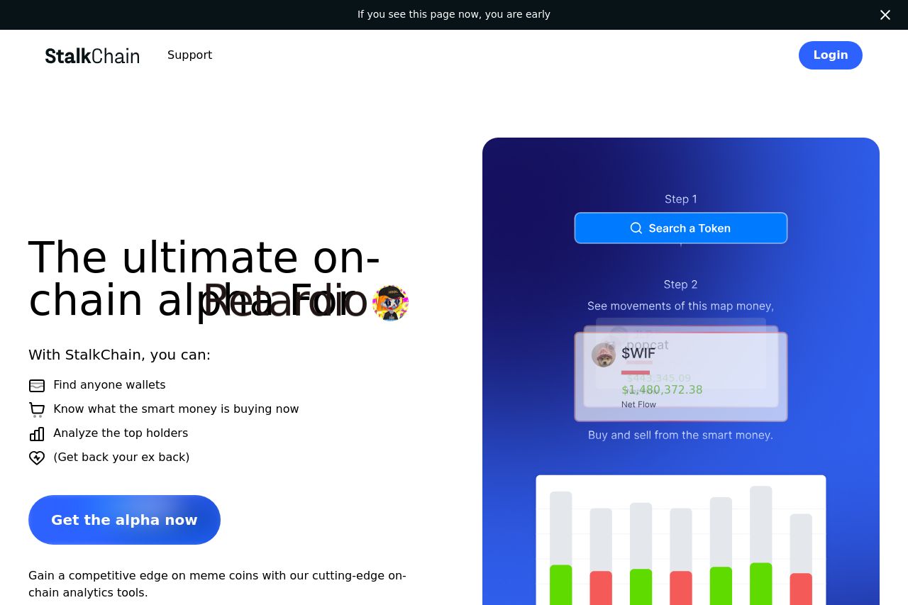
stalkchain.com
Landing Page Analysis
Harvest Memecoin Insights Stalkchain is your all-in-one on-chain research platform. Find and harvest the top memecoin traders.

Summary:
The page attempts to target crypto enthusiasts with a focus on memecoins, which is a niche but viable market. The value proposition around "on-chain alpha" is somewhat clear but could benefit from stronger emphasis on benefits rather than buzzwords. The hero section tries to catch attention but struggles due to overlapping text issues and dull graphic choices. Overall, the readability is harmed by inconsistent font sizes and lackluster text layout, making the page less engaging than intended. Visual hierarchy is also poorly managed as important elements don't stand out effectively. Lastly, while some graphics are present, there's a significant lack of social proof or credibility elements, missing an opportunity to build trust with potential users.
- Fix text overlap issue in the hero section for better readability.
- Enhance visual hierarchy by using diverse font weights and colors.
- Include testimonials or client logos to improve credibility.
- Add clear examples and previews to explain the product better.