hausarztpankow.de
Landing Page Analysis
Ganzheitliche & individuelle Behandlung Hausarztpraxis Naumann. Schulmedizin sowie ergänzende Therapien wie Akupunktur und Homöopathie.
63

Share on:
Summary:
48
Messaging
70
Readability
68
Structure
36
Actionability
50
Design
90
Credibility
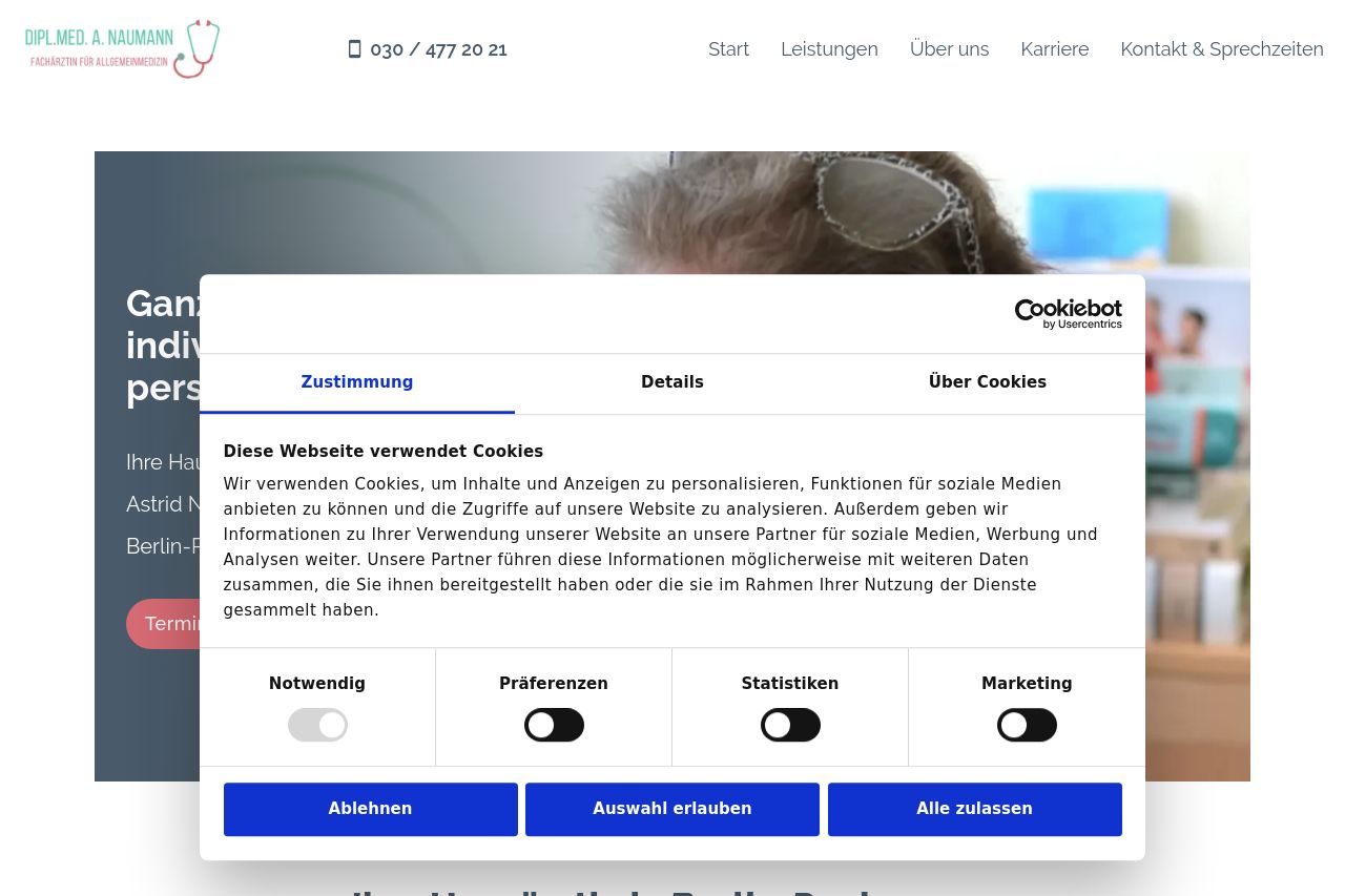
The website attempts to position itself as a holistic and individual healthcare provider, but the imagery and text don't quite synergize. The hero section lacks a compelling visual burst, and the cluttered cookie consent dialogs are severely distracting. The call-to-action buttons don't stand out, making it a chore to navigate through the page. Although the color scheme aligns decently with the healthcare theme, it misses out on utilizing high-contrast elements that guide the eye effectively. The tone is professional, yet the audience engagement is minimal due to underwhelming storytelling and intrigue.
Main Recommendations:
- Reduce cookie consent popup frequency; it obstructs critical information.
- Enhance call-to-action visibility by using contrasting colors for buttons.
- Revamp hero section with a strong, engaging visual background.