codewithandrea.com
Landing Page Analysis
Learn how to become a Flutter Pro and build production-ready apps on mobile and beyond.
80

Share on:
Summary:
75
Messaging
75
Readability
85
Structure
60
Actionability
70
Design
90
Credibility
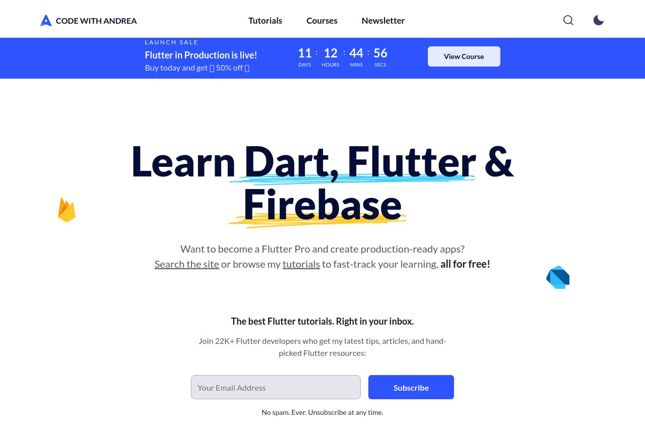
The landing page is visually appealing with a clean design and well-structured content. The use of bold typography for "Learn Dart, Flutter & Firebase" immediately captures attention, and the layout effectively guides the viewer through the material. However, the call to action could be more prominent, and the overall messaging might benefit from more explicit targeting to distinct user personas. The design is consistent, yet the color scheme lacks some contrast, making certain elements blend in too much. The testimonials add credibility, but there's a lack of interactive elements or engaging visuals that would elevate user engagement.
Main Recommendations:
- Enhance CTA placement and differentiate it visually.
- Increase color contrast for better readability.
- Incorporate interactive or engaging visual elements.