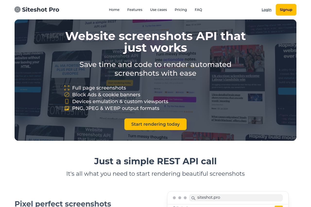
siteshot.pro
Landing Page Analysis
A screenshot API platform to render beautiful and automated website screenshots

Summary:
The website tries to deliver a straightforward showcase for its screenshot API, targeted at developers. The use of bold, clear text in the hero section is effective, but the repetition of the "Start rendering today" button without variation is frustrating and lazy. The design language is consistent, albeit a bit dull due to limited color usage, but at least there's effective use of white space. The value proposition could be stronger, as it feels generic. The testimonials help build trust, yet they don't stand out visually due to the monotone section design. Meanwhile, the use of technical features without further explanation might alienate those without prior knowledge.
- Revise the value proposition to be more specific and engaging.
- Differentiate CTA buttons to avoid repetition fatigue.
- Enhance the features explanation with visual aids or examples.