doublecheckme.com
Landing Page Analysis
Simplify homework and quizzes with the power of AI.
Summary:
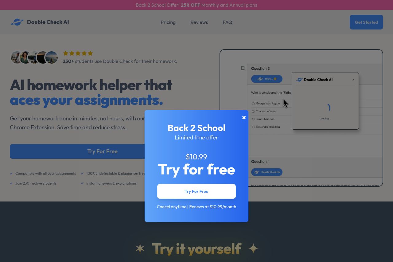
The landing page for Double Check AI has some strengths but also several areas needing significant improvement. The value proposition is somewhat clear, emphasizing an AI homework helper that "aces your assignments," but it's a bit clunky and not particularly catchy for college students. The persistent pop-up "Try for free" is invasive and disrupts reading flow, creating a poor user experience. The call to action (CTA) is overly repetitive and fails to create urgency or excitement, likely deterring conversions rather than enhancing them.
Visually, the page is fairly consistent with a modern, simple color scheme. However, too many different sections compete for attention, making the layout feel cluttered. The typography varies without clear hierarchy, making critical information harder to absorb at a glance.
Credibility indicators such as testimonials are a plus, but there's a lack of professional trust elements like verified reviews or solid brand partnerships, which might make potential users skeptical.
Overall, the page needs more cohesive storytelling to engage its target audience effectively, along with a structure that doesn't distract with incessant pop-ups and delivers a smoother exploration from introduction to sign-up.
- Reduce or remove the intrusive "Try for Free" pop-up to improve user experience.
- Streamline the information hierarchy to make essential content stand out more.
- Enhance credibility with more authoritative trust elements like verified reviews.