shibutz.com
Landing Page Analysis
The tool that helps school principals start the year without stress.
Summary:
The landing page for Shibutz focuses on a clear, straightforward value proposition aimed at school principals. The main headline, "Class assignments in days, not weeks," does a commendable job of immediately communicating the core benefit of the product, which seems designed to alleviate a common pain point for school administrators.
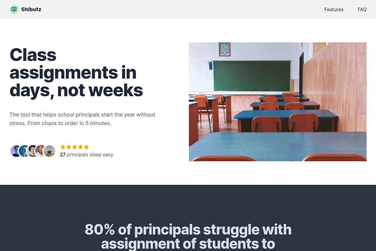
Visually, the page uses a simplistic and professional design. However, there is a lack of strong visual hierarchy which can make navigation less intuitive. The color palette is consistent but lacks vibrancy, which can make elements blend together instead of stand out.
The messaging is solid but a bit too generic. Phrases like "80% of principals struggle with assignment of students" effectively highlight user pain points but don't drive a sense of urgency or a specific call to action.
The readability of the page is compromised by some too-long sections and overly generic text. While the layout follows a standard format, it fails to creatively engage the target audience with unique features or interactive elements.
The CTA "Join Waitlist" is somewhat engaging but could be improved with more compelling language or placement. Finally, the page is detailed in describing features, yet it lacks enough social proof elements to build trust effectively.
- Enhance the visual hierarchy by using contrasting colors for CTAs and important sections.
- Add more social proof elements like testimonials or recognizable client logos.
- Improve text engagement by breaking up longer paragraphs and using more specific, action-oriented language.
- Experiment with more vibrant colors to increase element contrast.