ludusmagnus.fit
Landing Page Analysis
Summary:
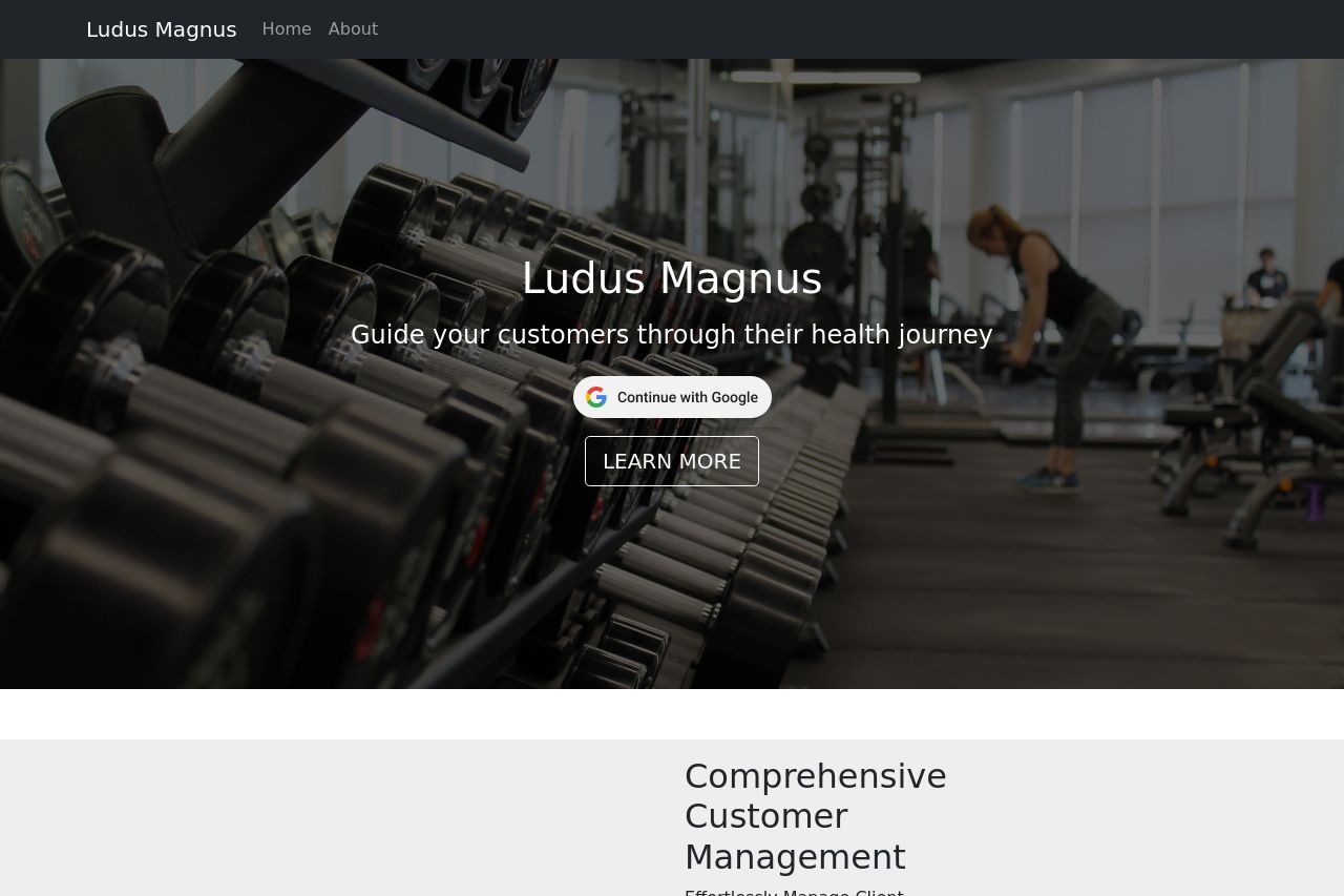
The page has a promising concept but falters in execution. The value proposition is muddled and doesn't directly convey what Ludus Magnus offers from the get-go, leaving visitors a bit bewildered. The design uses a lot of dark colors which can be engaging but risks being a bit oppressive without appropriate contrast. However, the imagery is relevant and aligns with fitness, adding visual context to the messaging. Typography needs more punch for clarity, especially since the text can come across as dense with longer words that feel unnecessarily complex. Consistency in font size would help bolster its message delivery.
On the plus side, the visuals of muscle-building and exercise equipment resonate well with the target market, but this is undercut by verbose script. The social proof and professionalism aspects are not strongly established, since there's no significant indication of credibility like staff profiles or testimonials.
- Clarify the main value proposition immediately in the hero section.
- Simplify text and remove jargon to enhance readability.
- Add testimonials or trust badges to build credibility.