raffleleader.com
Landing Page Analysis
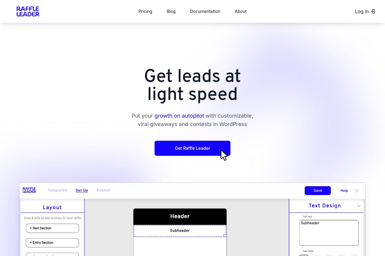
Easily create beautiful giveaways exactly to your liking with Raffle Leader, the best WordPress giveaway marketing plugin.
Summary:
Overall, the landing page for Raffle Leader establishes a decent foundation but misses the mark in several key areas.
The value proposition is clear in the hero section, yet it lacks repeating or expansion throughout the page, which misses opportunities to firmly cement it with the audience. The CTAs are visible and action-oriented, "Get Raffle Leader," standing out with that bold blue button; however, they lack frequency following crucial sections.
The design uses a consistent color scheme of purple and white, aligning with the brand and providing a visually appealing look. But the contrast might be too overpowering, especially with certain text and sections on a solid purple background. The sections are logically structured with clear headings; however, the navigation needs strengthening with well-defined headings and distinguishing elements to improve flow and engagement.
The tone is casual yet tries to be professional; however, there's room for improvement in audience engagement and resonance. Social proof elements, such as trust logos or testimonials, are missing, which critically impacts credibility and user trust.
Readability is hindered somewhat due to layout and lack of visual cues separating important sections and textual hierarchy. Whitespace helps with clutter, but the overall structure needs more refinement for easier information digestion. With a few improvements, the page can significantly enhance conversion potential and user experience.
- Add customer testimonials or trust badges to improve credibility.
- Introduce more CTAs throughout the page to encourage user interaction.
- Enhance text hierarchy and visual layout for better readability.
- Strengthen audience alignment by using specific examples or case studies.