herokuapp.com
Landing Page Analysis
Summary:
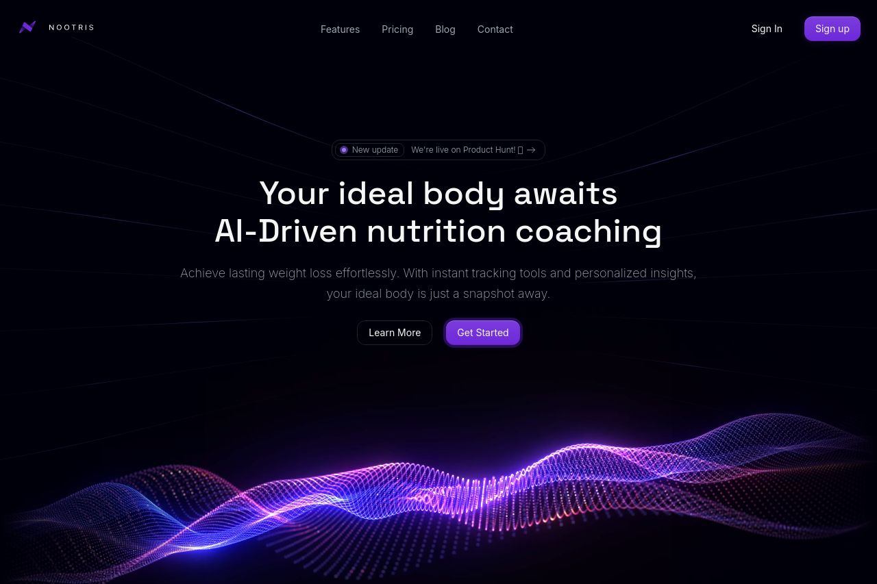
The landing page for Nootris is visually striking but has a few areas that need refinement. The hero section does a strong job with its core message, "Your ideal body awaits," yet it lacks specificity on what truly sets Nootris apart. The tone is consistent throughout and quite sleek with its modern design and use of purple highlights. Messaging could be improved by better defining its audience and value proposition. Readability is generally good with solid text contrast, though some sections are wordy, reducing impact. Design-wise, the color scheme is coherent, but more visual hierarchy could enhance focus on key points. CTAs are clear and prominent, yet their placement could be optimized. The credibility elements are somewhat lacking; there's minimal social proof which might undermine trust.
- Enhance CTA placement throughout the page to improve conversion rates.
- Include more social proof elements like testimonials or client logos to build trust.
- Refine messaging to better connect with and define the target audience.