osinters.bio
Landing Page Analysis
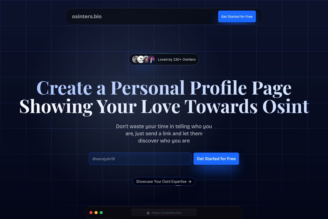
Create a Personal Profile Page Showing Your Love Towards Osint
Summary:
The page overall gives off a niche-specific vibe with good potential, but there are several issues that need addressing to enhance user engagement and clarity. Good Points: The value proposition of creating a personal profile for OSINT enthusiasts is intriguing and clear, targeting a very specific audience. The dark color scheme fits the subject matter and maintains a professional look. Bad Points: The design suffers from too much homogeneity; headings and body text often blend due to lack of visual hierarchy, weakening its impact. Text placement feels cluttered, and the color contrast could be improved for better readability. The Call to Action (CTA) buttons are repetitive and could be more effectively utilized. Additionally, social proof seems weak and could benefit from more diverse testimonials.
- Differentiate headings more clearly to improve readability.
- Enhance the CTA buttons with more distinct designs and placements.
- Increase contrast between text and background for better readability.