testit.so
Landing Page Analysis
Create experiments in just a few clicks and start improving your conversion rate today. No coding required. Want to be sure your landing page converts? Test it!
Summary:
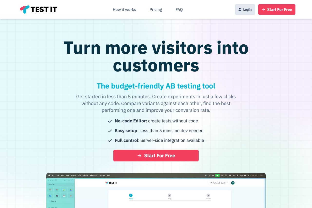
Visually, the landing page maintains a clean, structured look with consistent colors and typography. It combines a modern design with a professional aesthetic, making it appear trustworthy. The messaging is a strong point, with a clear value proposition right at the top: “Turn more visitors into customers.” This makes it immediately obvious what the site is about. The scarcity and urgency tactics in the pricing section, such as "Limited One-Time Offer," effectively entice users.
On the downside, the repeated "Start For Free" buttons could appear overwhelming and might blend into the background due to the color repetition. This diminishes their effectiveness as clear calls-to-action (CTAs). Also, despite the multiple testimonials, the pages feel quite text-heavy, which might disengage some users. Additionally, while testimonials are present, they are heavily weighted towards founders or marketers, lacking diversity in perspectives.
Overall, the website balances professionalism with personality but suffers from some monotony and redundancy in visual elements, which could hinder conversion rates.
- Make CTAs more distinct from regular text to enhance actionability.
- Reduce text density and improve visuals to maintain engagement.
- Include testimonials from a wider range of users to increase trust.